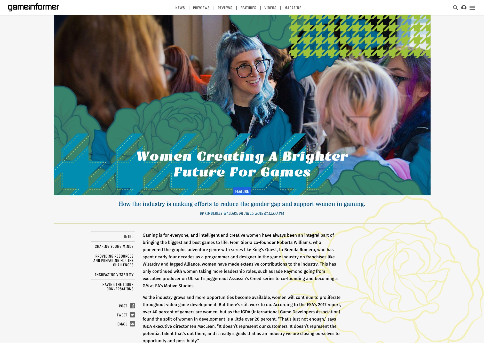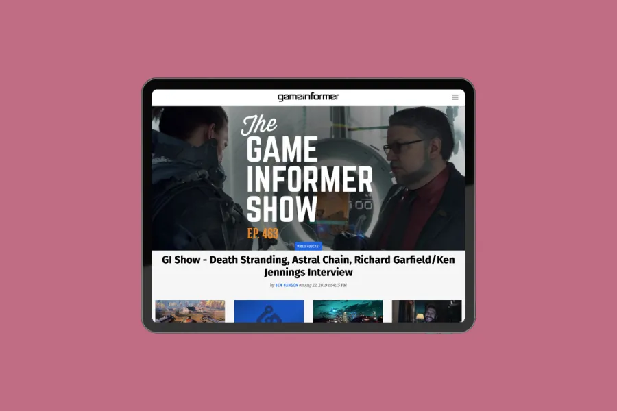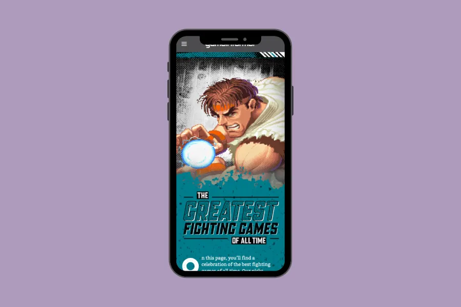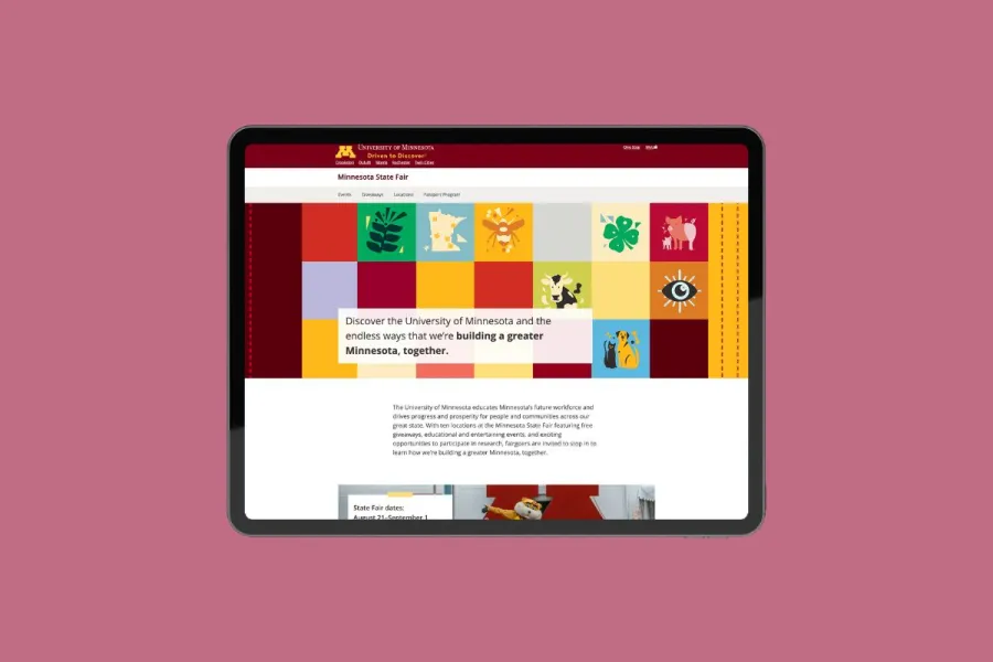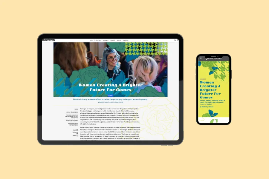
For this feature story on reducing the gender gap in the gaming industry, I adapted an existing print magazine layout into responsive digital experiences for both web and mobile.
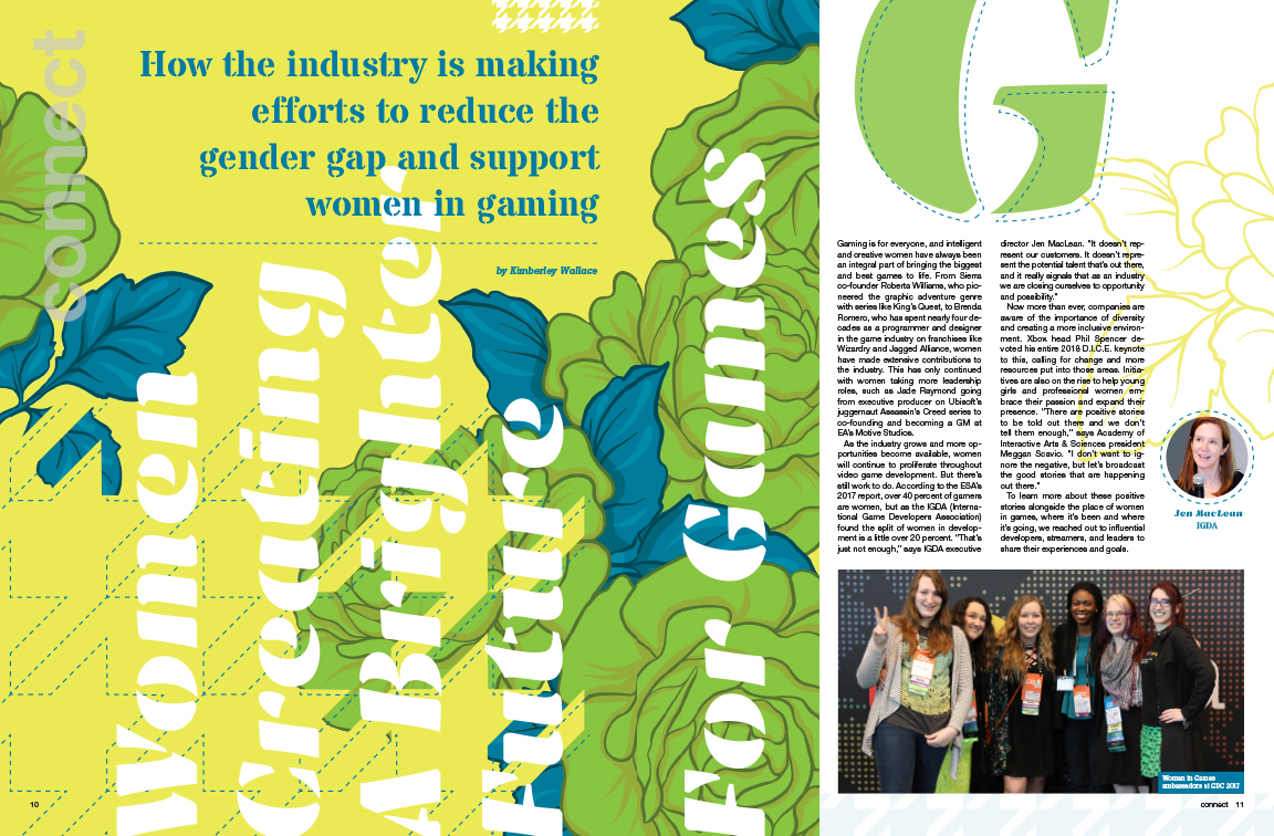
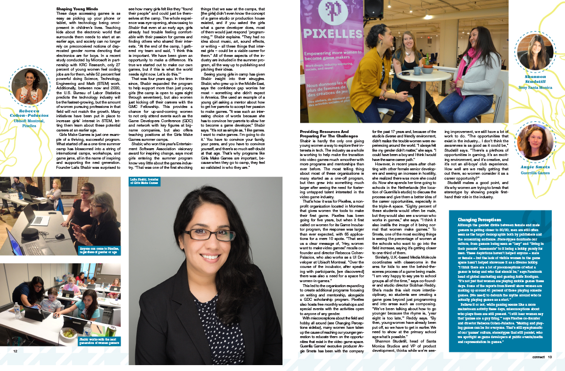
I translated static, multi-column print designs into fluid HTML/CSS layouts for GameInformer.com and optimized content components for the Game Informer mobile app—ensuring typography, image hierarchy, and visual impact translated seamlessly across all screen sizes.
Mobile App
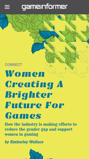
This version was created using HTML, CSS, and JavaScript, and compiled using Mag+ to convert it for use within the Game Informer app, as part of the June 2018 mobile edition of the magazine. To create this page, I was provided with print designs and asked to convert them to a coordinating, mobile-friendly layout.

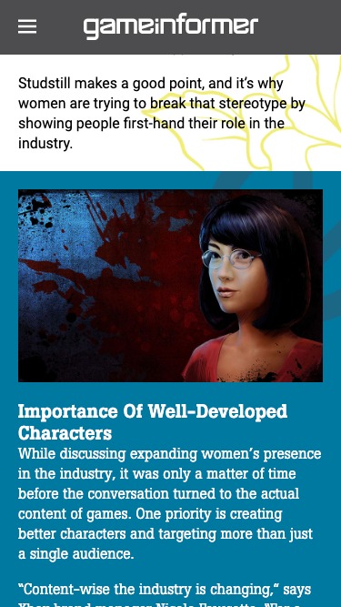
Website
I was also asked to convert this article for use on GameInformer.com. I customized a page within the site Drupal CMS following a provided design. This version was responsive for all device sizes and integrated within the current site theme. It also includes a parallax header image with moving elements.
The major challenge I encountered with developing this article for the site was adding custom design elements within an established CMS article template. I was limited in the template changes I could make to the article format.
You can view this page and read the article at GameInformer.com.